Deschutes Brewery
Project:
Hop Collection
Industry:
Beverage
Personal Role:
Creative, Production, Illustration, Typography,
Color Design
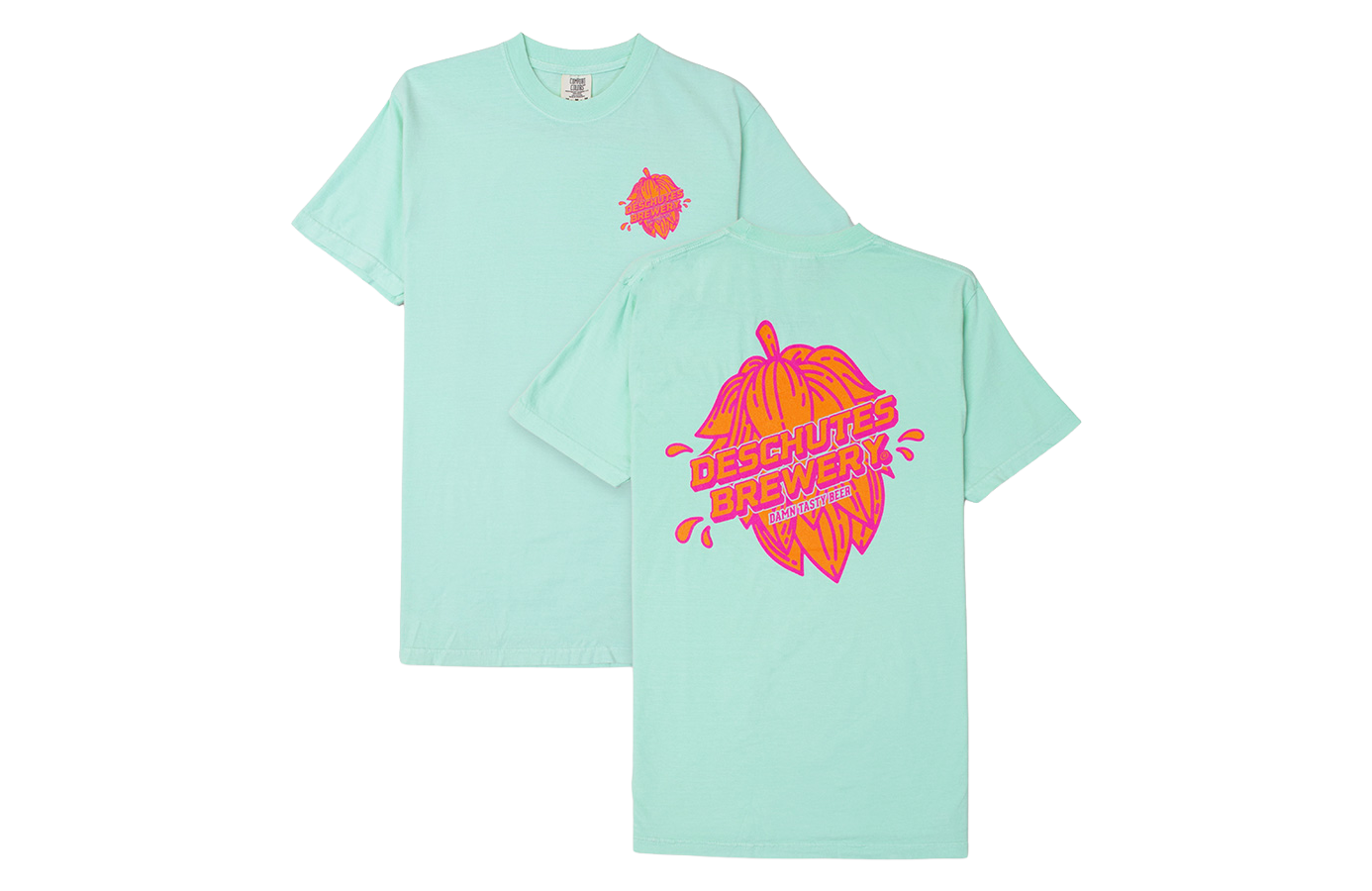
Deschutes Brewery, a Bend, Oregon-based craft brewery, is one of the largest beer operations in the United States and has been in the game since 1988. I’m so grateful to have had the opportunity to work with this legendary brand!
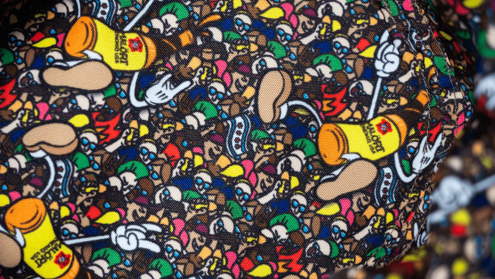
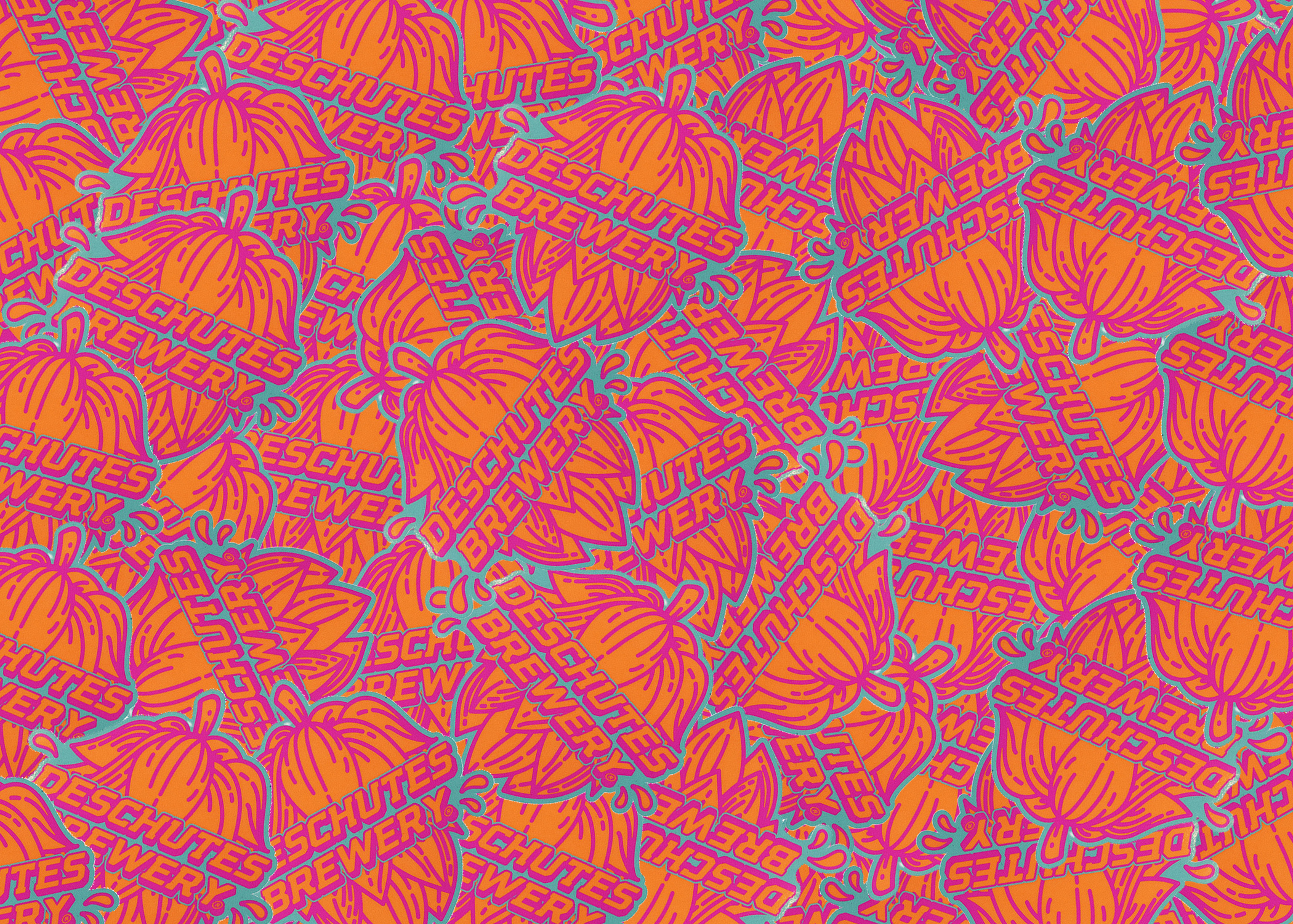
This tee design was originally pitched as part of a suite of apparel concepts intended to reinterpret the flagship Fresh Squeezed IPA line, but Deschutes Brewery loved it to the point that it was retooled into a general brand tee through the pairing of my hop illustration and my colleague Kyle Emry’s type treatment, which found a place in other use cases such as stickers and playing cards as well.


Deschutes presented my team with a moodboard of potential apparel ideas, one of which including a small center chest monoline print. This inspired me to push in a postage stamp direction with hops growing out of one of their signature cans and providing a shoutout to the beer capital from which they flow.
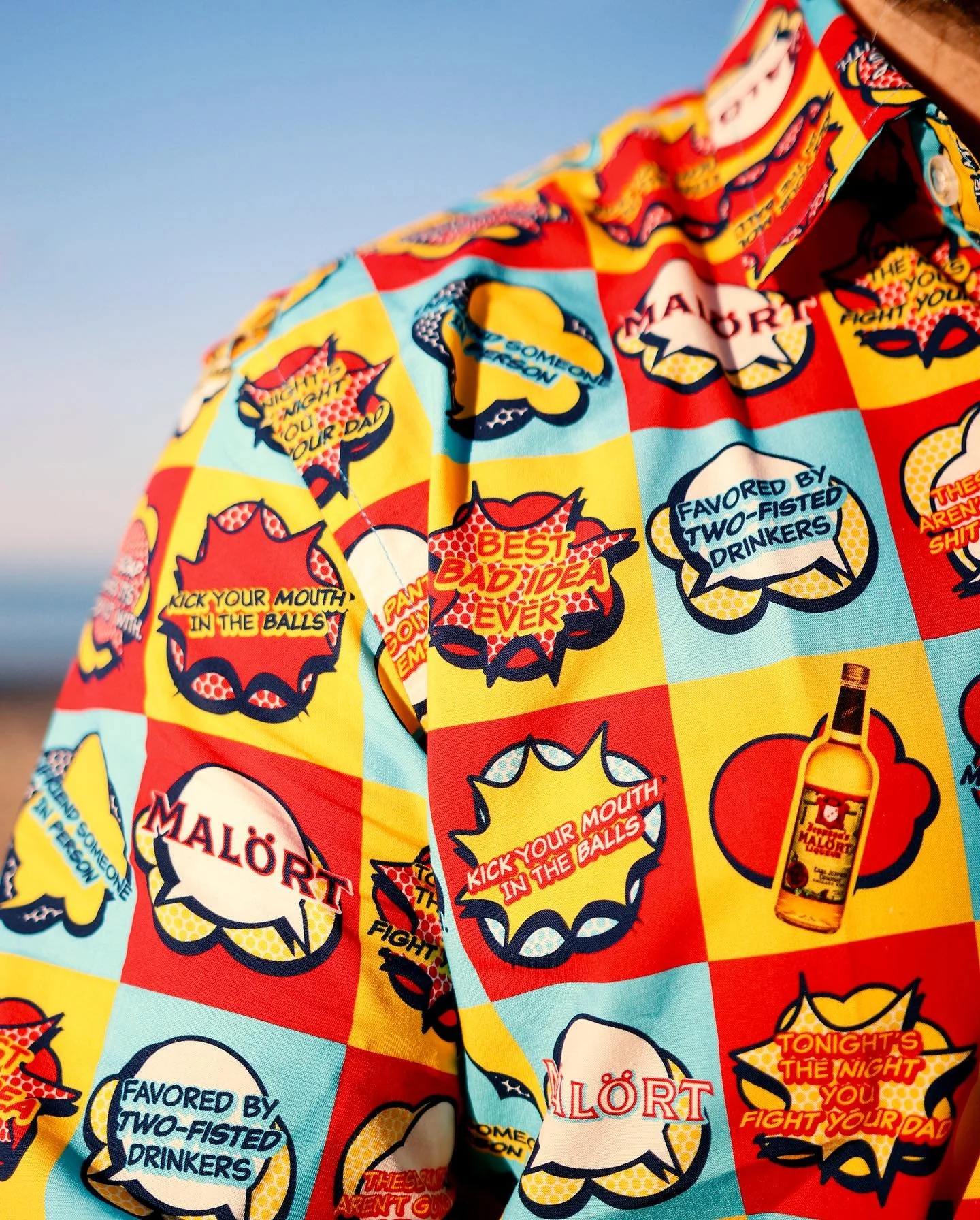
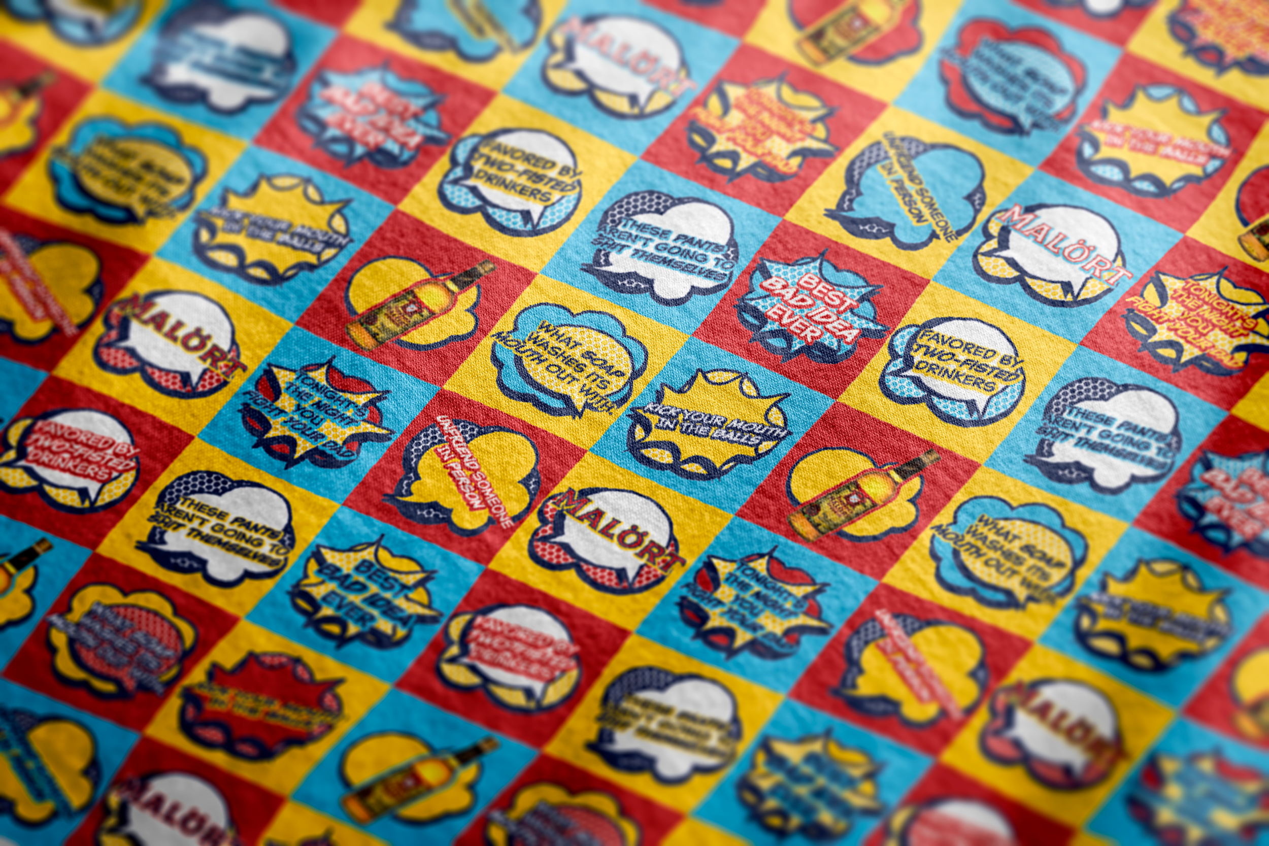
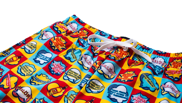
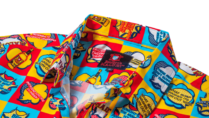
Lines like “What Soap Washes Its Mouth Out With” and “Kick Your Mouth In The Balls” illustrate the love-hate cult following behind the brand, and a primary color palette pulled from the golden-yellow liqueur and Chicago flag ties back to the local heritage as well as playing on the 4-color process in which comics using such speech bubbles are printed.